Does it need to be a bar graph?
May 03, 2022
I love bar graphs, but there are great alternatives that work better in some cases to show the data more clearly and help the audience understand the message more easily.
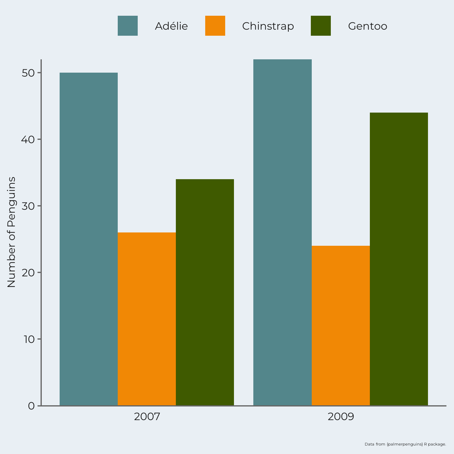
Returning to the Palmer Penguin data set. Say, we want to compare the number of penguins of each species between two years. We could make a bar graph with the count of penguins by species each year. The bar graph makes it easy to compare the number of penguins of each species within a single year. But it is hard to compare the number of penguins between the years. We also have to compare the bars with the legend to understand what each color represents.
Alternatively, a slope graph could be used. Now, we have a point for the number of penguins in each species in both years with a line connecting the two years. This makes it easy to compare the number of penguins of each species across the two years AND compare the number of penguins across the three species. Slope graphs are great for showing change between two time points. The lines and points have also been labeled directly, so there's no need to jump between the graph and a legend.

Slope graphs are one of my favorite graphs for showing change over time. Have you used a slope graph before? When could you apply it in the future?
Sign up for our newsletter for more data visualization tips and tricks, to get the behind the scenes look at Schilling Data Studio, and be the first to know when new courses come out!
Stay connected with news and updates!
Join our mailing list to receive the latest news and updates from our team.
Don't worry, your information will not be shared.
We hate SPAM. We will never sell your information, for any reason.
